TNM Smart App
My role
As the only product designer for the project, I joined a team of four talented developers. We collaborated daily and worked along side other important teams within TNM. I provided relevant support until the completion and launch of the app.
My responsibilities included:
- Collaborating with the marketing team to identify user patterns on the app
- Facilitating workshops to assess user interaction and usability of the app
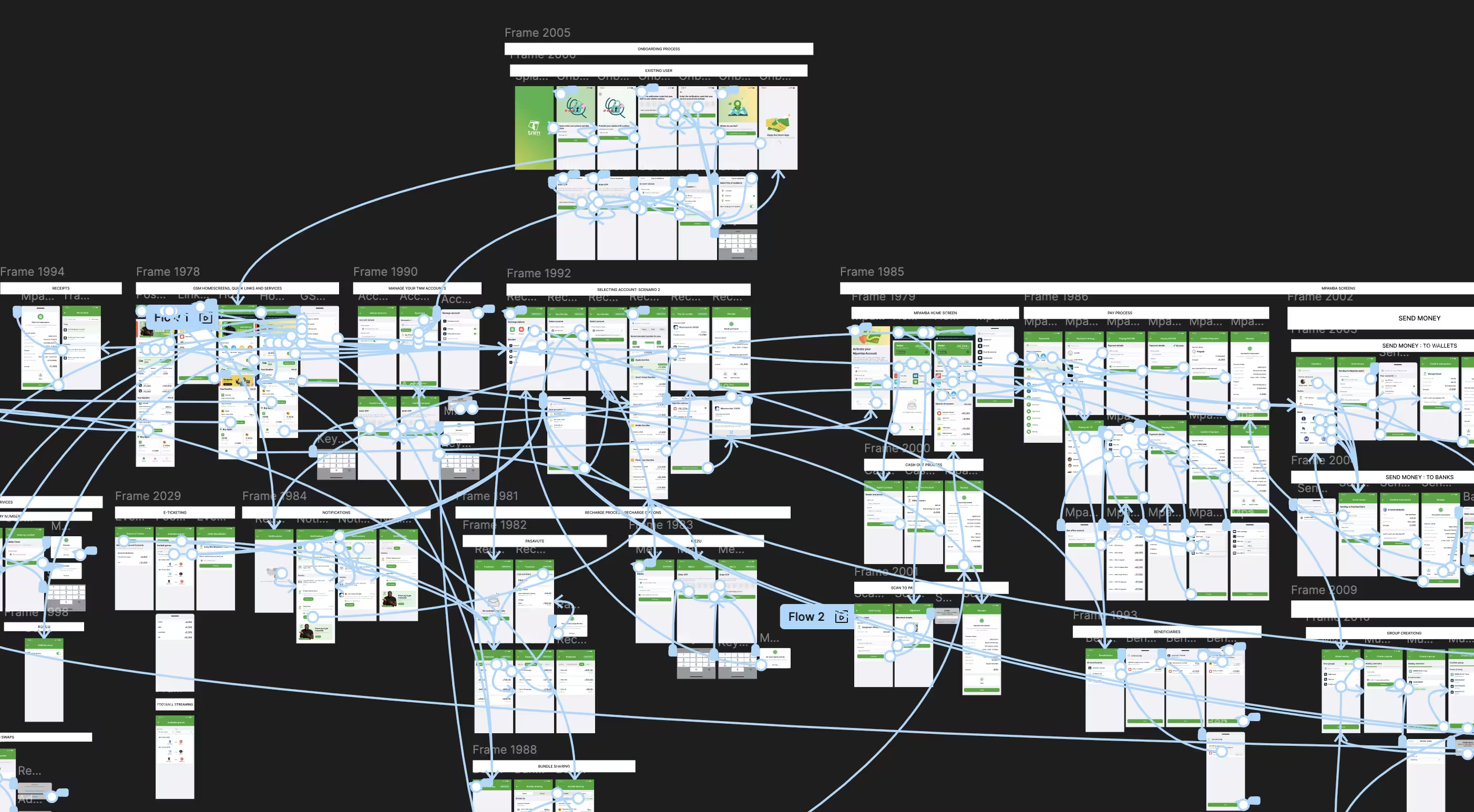
- Creating Wireframes
- Working on visual and interaction design
- Creating clickable prototypes in Figma to easily test ideas
- Creating supporting resources such as illustrations to be used on empty states and error screens
Heading 1
Heading 2
Heading 3
Heading 4
Heading 5
Heading 6
Lorem ipsum dolor sit amet, consectetur adipiscing elit, sed do eiusmod tempor incididunt ut labore et dolore magna aliqua. Ut enim ad minim veniam, quis nostrud exercitation ullamco laboris nisi ut aliquip ex ea commodo consequat. Duis aute irure dolor in reprehenderit in voluptate velit esse cillum dolore eu fugiat nulla pariatur.
Block quote
Ordered list
- Item 1
- Item 2
- Item 3
Unordered list
- Item A
- Item B
- Item C
Bold text
Emphasis
Superscript
Subscript
Creative process
After reviewing customer activity data from the marketing team and drawing up personas, it was clear that the app has two groups of users: tech-ready users, who are in the age group of 18-35 and non-tech-ready people, aged 40-65.
While both groups are heavy users of internet bundles, the people who bring in more revenue are those who are not tech-ready. These are mainly people in the corporate space, purchasing internet bundles with large volumes and voice bundles for phone calls.
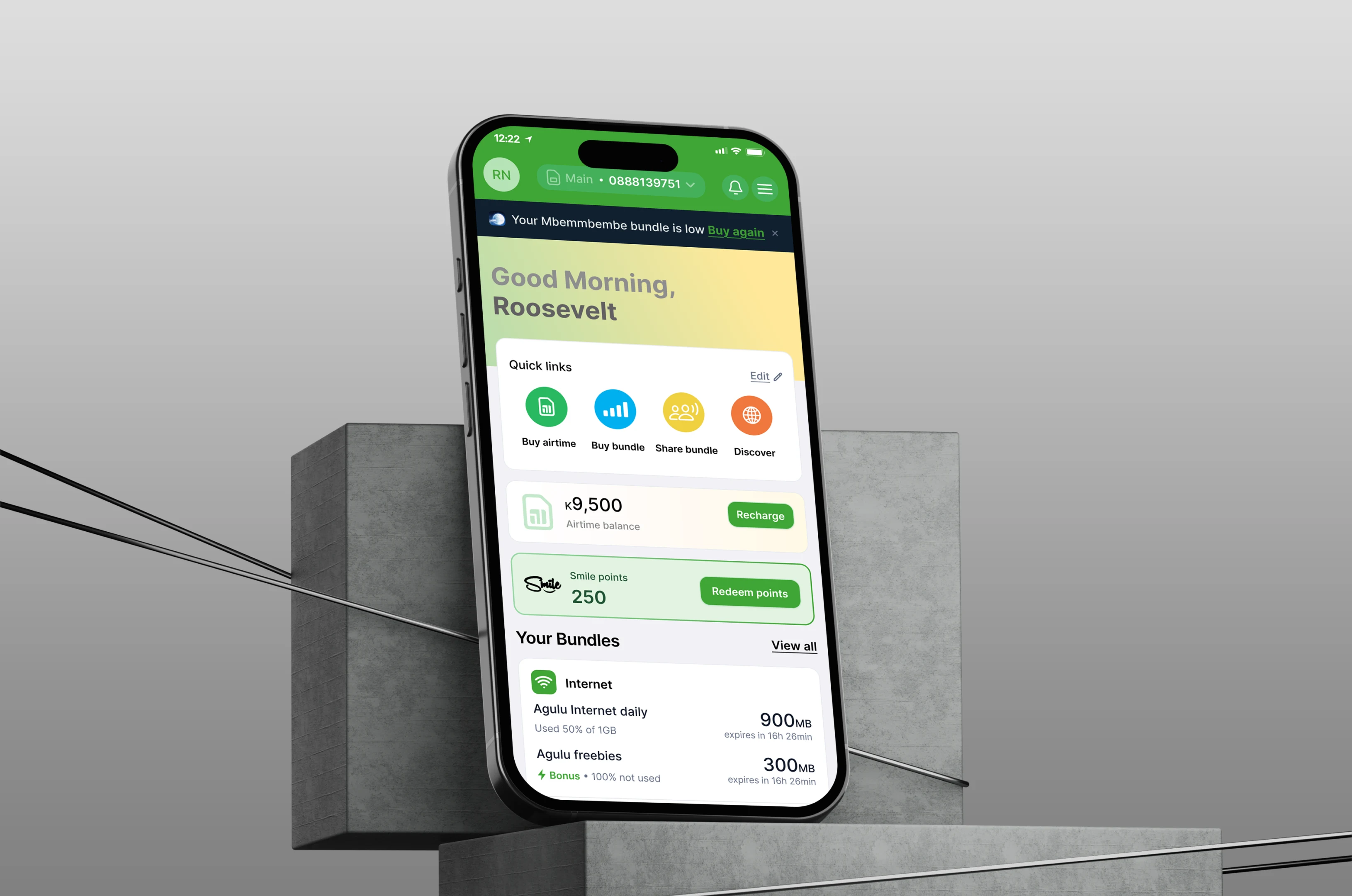
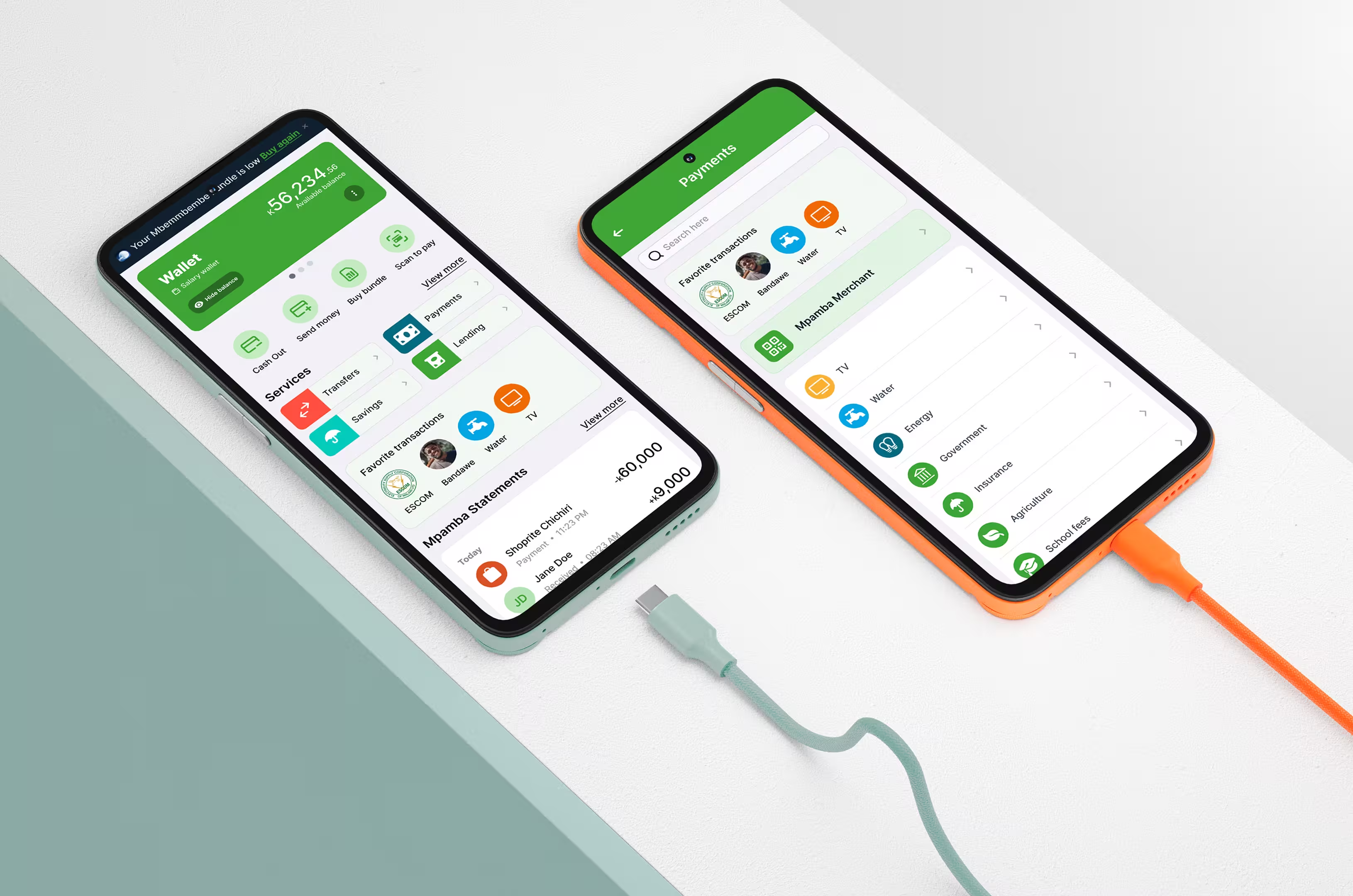
I had to create an interface that served both groups of users. My direction was to create an interface that struck a balance between exciting and corporate; using bright colors, correct language, modern UI design elements, imagery, and iconology.
Keeping in mind that the app will be used on both iOS and Android devices, the interface relies on a well defined design system and component library, ensuring that the app looks and feels the same on these two difference platforms while respecting iOS and Android best practices of design and development.
Heading 1
Heading 2
Heading 3
Heading 4
Heading 5
Heading 6
Lorem ipsum dolor sit amet, consectetur adipiscing elit, sed do eiusmod tempor incididunt ut labore et dolore magna aliqua. Ut enim ad minim veniam, quis nostrud exercitation ullamco laboris nisi ut aliquip ex ea commodo consequat. Duis aute irure dolor in reprehenderit in voluptate velit esse cillum dolore eu fugiat nulla pariatur.
Block quote
Ordered list
- Item 1
- Item 2
- Item 3
Unordered list
- Item A
- Item B
- Item C
Bold text
Emphasis
Superscript
Subscript


Simplified user-journey
- One app, two uses. Since the app is used for both SIM management (GSM operations) and the Mpamba mobile wallet, it was difficult for users to navigate through the app, considering the fact that the two modules are connected depending on the use case. I, therefore, needed a bulletproof solution that would work for all use cases.
- Easy access. Borrowing from the arrangement items/products in isles of retail shops, I introduced quick links on the home screen and restructured the layout of products and services within the app to ensure that frequently used services/products were visible and accessible to the customer.
- Use of the right language. The language used to describe an action, a flow, and feedback was refined to be clear and less technical to help users make fast and accurate decisions when using the app.
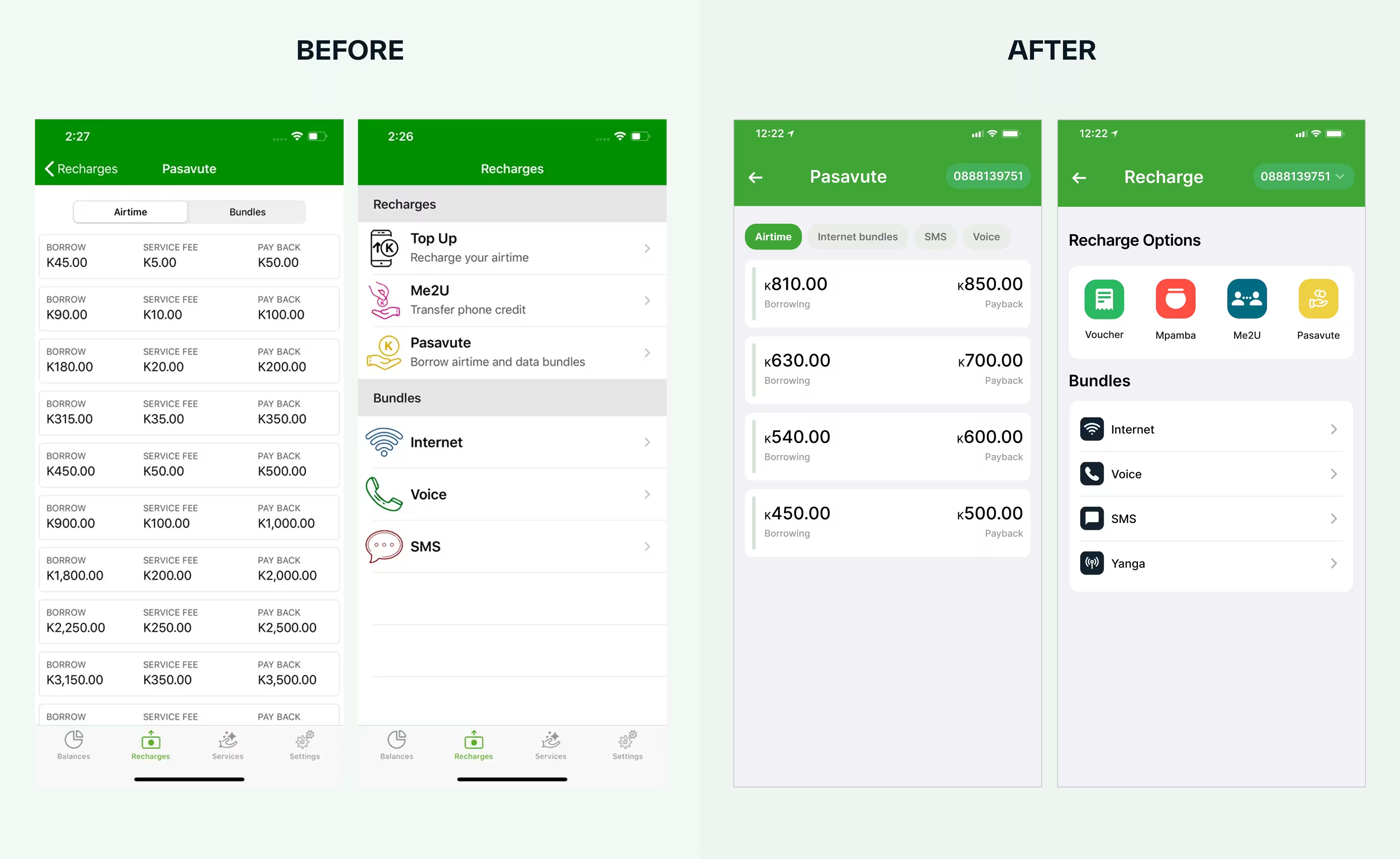

Improving the app's look and feel
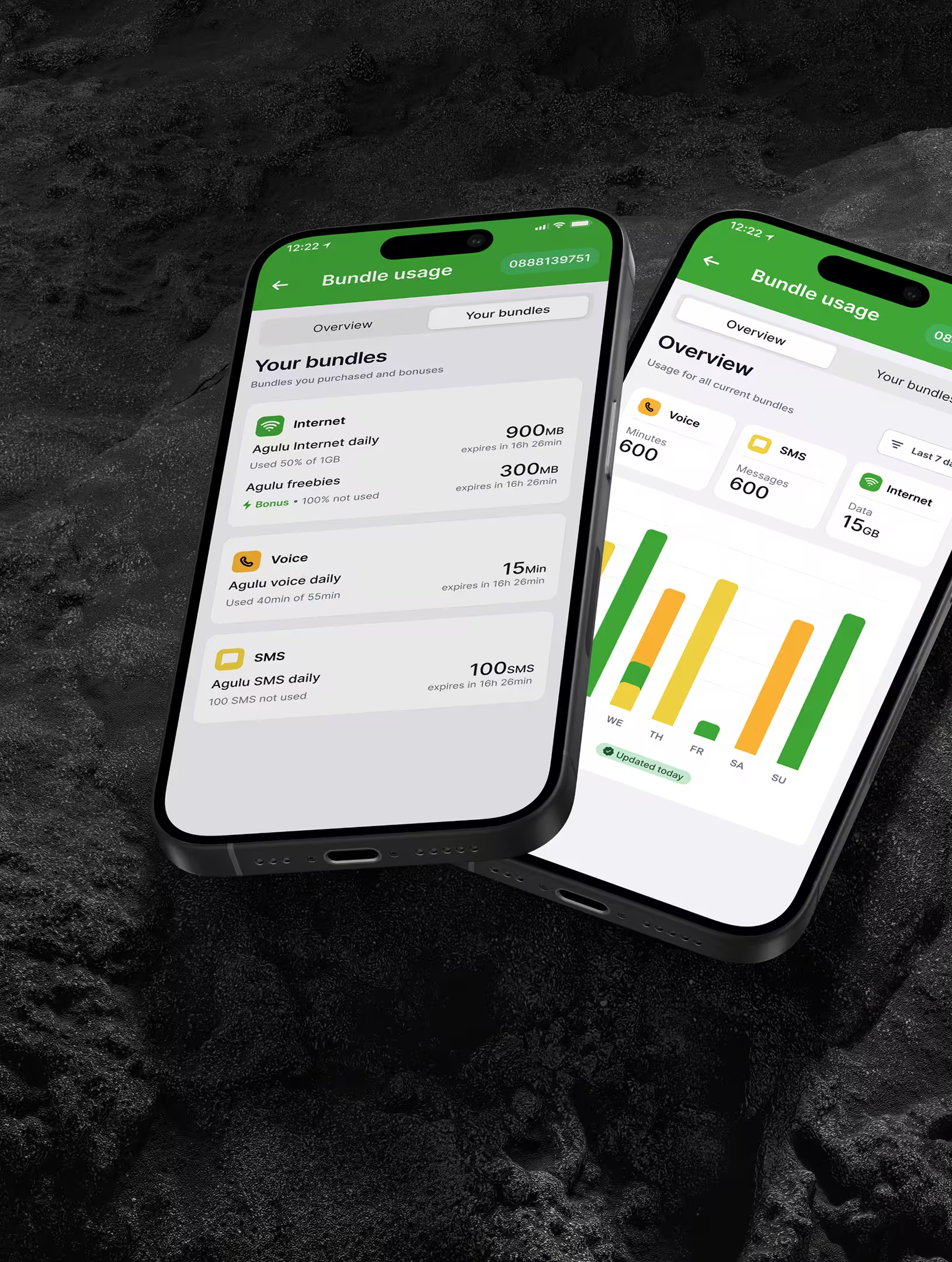
- Using a well defined component UI kit. Elements of the app come from a well defined design system, which include: colors, font, typography, guidelines on the usage of inputs, buttons, badges and other UI elements.
- Use of Modern UI elements. I made use of modern UI styling with buttons, modals, badges and other UI elements to make the app’s look contemporary while respecting both iOS and android best practices for design and development.
New Smart app users
New users of the app after launch
App downloads
An increase in app downloads in both Google Play and App Store after launch
New TNM users
TNM on-boarded new 16,000 customers on the app.
New TNM users
TNM on-boarded new 16,000 customers on the app.
Working with Roosevelt on the TNM Smart App v6 was a game changer in shaping the user experience of our smart app. From simplifying navigation flows to creating a clean and engaging interface, his contributions significantly improved the overall user experience. We are grateful for his dedication, professionalism, and impact on this critical product.